The selection of interior paint colors is a foundational element in redefining a living space. It can transform a mundane room into an oasis of tranquility or a vibrant hub of activity. This article explores popular and effective interior paint color choices, focusing on those that offer a fresh new look, considering their psychological impact, design versatility, and current trends.
Color is not merely a visual attribute; it is a powerful psychological tool that influences mood, perception, and behavior. When considering a fresh new look, understanding how different colors interact with our emotions is paramount.
The Impact of Warm Colors
Warm colors, such as reds, oranges, and yellows, are known for their ability to create a sense of energy and coziness. They tend to advance visually, making spaces feel more intimate and inviting.
Reds: Passion and Energy
Reds can evoke feelings of excitement and passion. In interior design, a bold red can serve as an accent wall, injecting vigor into a room. Lighter shades of red, like coral or blush, offer a softer, more approachable warmth, promoting a sense of comfort and intimacy. Darker reds, such as burgundy or maroon, can add a touch of sophistication and drama, particularly in dining rooms or studies, creating an environment conducive to deep conversation and focused work. The careful application of red is like adding a spark to a hearth, igniting a certain warmth and dynamism within a space.
Oranges: Enthusiasm and Sociability
Oranges are often associated with enthusiasm, creativity, and sociability. They can create a cheerful and outgoing atmosphere. Terracotta and burnt orange hues bring an earthy, grounding feel, perfect for living areas or kitchens where family and friends gather. Brighter, more vibrant oranges can stimulate conversation and activity, making them suitable for playrooms or home offices. The introduction of orange into a room can be likened to welcoming a friendly gathering, fostering openness and lively interactions.
Yellows: Optimism and Cheerfulness
Yellows are widely recognized for their ability to engender feelings of happiness and optimism. Light, sunny yellows can brighten a room, making it feel larger and more airy, ideal for smaller spaces or areas with limited natural light. Deeper, golden yellows can add a sense of richness and warmth, evoking a feeling of harvest or contentedness. However, overuse of bright yellow can be overstimulating, so a balanced approach is often recommended. Yellow, in its varied facets, acts as a shaft of sunlight, dispelling shadows and infusing a sense of lightheartedness.
The Calming Influence of Cool Colors
Cool colors, such as blues, greens, and purples, tend to recede visually, making spaces feel more expansive and tranquil. They are often associated with serenity, calmness, and a connection to nature.
Blues: Serenity and Stability
Blues are deeply associated with calmness, stability, and peace. Light blues, like sky or robin’s egg blue, can create a serene and airy atmosphere, making them excellent choices for bedrooms and bathrooms, promoting relaxation. Deeper blues, such as navy or slate, offer a sense of depth and sophistication, providing a grounded and composed ambiance. Blues can also be perceived as cool and refreshing, making them a popular choice for warmer climates or rooms that tend to overheat. The presence of blue in a room can be akin to gazing at a vast, unruffled ocean, bestowing a sense of imperturbable peace.
Greens: Harmony and Renewal
Greens are the colors of nature, evoking feelings of harmony, balance, and renewal. Various shades of green can suit different moods and spaces. Light, minty greens can create a fresh and invigorating feel, suitable for kitchens or home offices. Deeper greens, such as forest green or emerald, offer a sense of richness and tranquility, perfect for living rooms or studies where a contemplative atmosphere is desired. Greens are also known for their ability to reduce stress and promote well-being. Green is the verdant breath of the earth, bringing a sense of revitalizing calm.
Purples: Royalty and Creativity
Purples, particularly lighter shades like lavender and lilac, can offer a sense of calm and creativity. They are often associated with introspection and spirituality. Deeper purples, such as plum or amethyst, can introduce a touch of luxury and sophistication, creating a dramatic and elegant statement, suitable for a formal dining room or a dramatic accent wall. The use of purple can be like opening a book of ancient lore, hinting at mystery and imaginative depth.
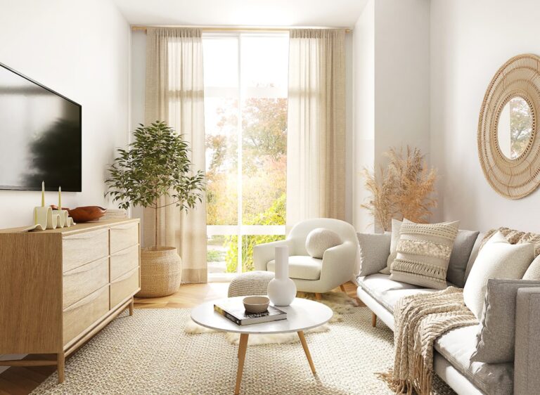
The Neutral Palette: Versatility and Sophistication
Neutral colors—whites, grays, beiges, and creams—form the backbone of many interior design schemes. Their strength lies in their versatility and ability to serve as a canvas for other colors and décor elements. A fresh look does not exclusively mean bright or bold; it can also mean a refined and updated take on neutrals.
Whites: Purity and Spaciousness
Whites are the ultimate minimalist choice, offering a sense of purity, cleanliness, and spaciousness. They reflect light exceptionally well, making rooms appear larger and brighter. Different undertones in white can drastically alter the feel of a room, from the cool, crispness of a stark white to the soft, creamy warmth of an ivory. White serves as a blank canvas, allowing furniture and art to take center stage. It is the whisper of a fresh start, creating an expansive and luminous environment.
Grays: Modernity and Balance
Grays have emerged as a sophisticated alternative to traditional neutrals. They offer a contemporary feel without the starkness of white. Light grays can provide a soft, airy ambiance, while charcoal grays can create a dramatic and grounded effect. The versatility of gray lies in its ability to pair with a wide range of accent colors, from vibrant hues to other muted tones. Gray is the steady hand of modernity, offering a sense of measured and balanced composure.
Beiges and Creams: Warmth and Timelessness
Beiges and creams offer a warmer, more inviting alternative to grays and whites. They provide a sense of comfort and coziness, creating a timeless appeal. These shades are excellent for achieving a relaxed, organic aesthetic, pairing beautifully with natural materials like wood and linen. Similar to white, they act as a welcoming embrace, fostering an atmosphere of ease and gentle familiarity.
When considering the perfect interior paint colors for your home, it’s essential to create a harmonious atmosphere that reflects your personal style. For those interested in enhancing their living spaces, you might find it helpful to explore related topics such as home maintenance and care. A great resource is an article on common car care mistakes that you would definitely prefer to avoid, which can provide insights into maintaining your belongings and ensuring they look their best. You can read more about it here: Car Care Mistakes.
Trending Color Palettes for a Modern Refresh
Beyond understanding the inherent qualities of colors, staying abreast of current trends can provide valuable inspiration for achieving a fresh, contemporary look.
Earthy Tones and Natural Palettes
There is a growing movement towards incorporating natural elements and earthy tones into interior design. These palettes are inspired by the landscapes and textures of the natural world.
Terracotta and Clay Hues
Warm, muted oranges and browns inspired by terracotta and clay are gaining traction. These colors bring an organic and grounded feel to a space, conveying warmth and a connection to the earth. They are particularly effective in living areas and dining rooms, creating an inviting and rustic ambiance. Think of the comforting embrace of a well-worn adobe structure; these hues offer a similar sense of rootedness and warmth.
Sage Green and Olive Green
Shades of muted green, such as sage and olive, continue to be popular. They evoke a sense of tranquility and balance, bringing the calming influence of nature indoors. These greens pair well with natural materials like wood, rattan, and stone, contributing to a serene and organic aesthetic. These are the colors of a quiet forest grove, promoting a sense of peace and understated elegance.
Muted Blues and Dusty Grays
Soft, desaturated blues and grays are also part of this natural trend. These colors provide a sense of understated sophistication and calmness, reminiscent of misty mornings or a cloud-laden sky. They are versatile and can be used as a primary wall color or as a backdrop for more vibrant accent pieces. These are the hues of a quiet dawn, offering a gentle transition and a sense of serene contemplation.
Bold Accents and Moody Hues
While calm and natural palettes remain popular, there is also a resurgence of interest in bolder statements and moodier color schemes.
Deep Blues and Greens
Rich, saturated blues and greens, such as navy, teal, and emerald, are being used to create dramatic and sophisticated spaces. These colors can add depth and character, transforming a room into a more intimate and luxurious sanctuary. They work exceptionally well as accent walls or in smaller rooms where a dramatic effect is desired. These deep hues are like the alluring depths of a nocturnal landscape, inviting exploration and a sense of rich immersion.
Moody Grays and Charcoals
Darker grays and charcoals are also making a statement, offering a modern and sophisticated alternative to lighter neutrals. They can create a sense of drama and intrigue, particularly when paired with metallic accents or lighter furniture. These colors are excellent for creating a cozy and enveloping atmosphere in living rooms or bedrooms. They are the strong, silent type of colors, conveying confidence and a refined presence.
Jewel Tones
Vibrant jewel tones, such as sapphire, ruby, and amethyst, are increasingly being used as accent colors to inject personality and luxury into a space. These colors are powerful and can be used sparingly to create focal points or to add a touch of opulence. They are the precious gems of the color spectrum, adding sparkle and intrinsic value to a design.
The Enduring Appeal of Whites and Off-Whites
Despite the trends towards bolder colors and earthy tones, whites and off-whites remain perennial favorites for a fresh and timeless look.
Crisp Whites
For those seeking an ultra-modern and minimalist aesthetic, crisp, clean whites are the ideal choice. They maximize natural light and create an illusion of greater space, making them perfect for contemporary living. These are the clean lines of a newly drawn architectural sketch, pure and unadulterated.
Warm Off-Whites and Creams
Warm off-whites and creamy hues offer a softer, more inviting approach to white. They provide a sense of comfort and understated elegance, creating a welcoming atmosphere that is less stark than pure white. These are the gentle whispers of comfort, a delicate balance between purity and warmth.
Leveraging Color in Different Room Types
The choice of paint color can significantly influence the function and feel of each room within a home. Tailoring color selections to the specific purpose of a space is key to achieving a successfully fresh new look.
Living Rooms: Inviting and Relaxing Atmospheres
Living rooms are often the heart of the home, requiring a balance of comfort and inviting aesthetics.
Soft Grays and Warm Beiges
These neutrals provide a versatile canvas, allowing for personalization through décor and furnishings. They create a calm and welcoming environment conducive to relaxation and socializing. They are the reliable anchors of a well-loved space.
Muted Blues and Greens
These cool tones can promote a sense of serenity and tranquility, making the living room a peaceful retreat. They are especially effective in rooms where natural light is abundant. They are the gentle breezes that bring a sigh of relief.
Accent Walls in Bold Hues
For a more dynamic feel, consider a bold accent wall in a deep blue, emerald green, or even a warm terracotta. This provides a focal point without overwhelming the space. This is the unexpected flourish that captures the eye.
Bedrooms: Creating Tranquil Sanctuaries
Bedrooms are intended for rest and rejuvenation, making color choices that promote calmness and relaxation paramount.
Pale Blues and Lavenders
These soft, cool tones are known for their calming properties, helping to create a serene and peaceful atmosphere conducive to sleep. They are the lullabies of the color world, gently ushering in rest.
Soft Greens and Muted Grays
These colors mimic natural elements and offer a sense of balance and tranquility. They contribute to a spa-like feel, promoting relaxation and de-stressing. They are the quiet whispers of a calm mind.
Warm Creams and Ivories
For a cozier, more intimate feel, warm neutrals like cream and ivory can create a sense of comfort and safety. They provide a soft backdrop that is conducive to rest. They are the soft embrace of a comforting blanket.
Kitchens: Inspiring and Functional Spaces
Kitchens are often hubs of activity, requiring colors that can be both inspiring and forgiving.
Soft Whites and Light Grays
These classic choices keep the space feeling bright and airy, reflecting light and making it appear larger. They are versatile and can easily accommodate changing décor trends. They are the clean slates of culinary creation.
Muted Greens and Blues
These colors can add a touch of freshness and sophistication to the kitchen. Sage green, in particular, pairs well with natural wood cabinetry. They are like a breath of fresh air in a busy environment.
Warm Yellows and Oranges (as accents)
Used sparingly, these warm colors can add a cheerful and energetic touch to the kitchen, stimulating appetite and conversation. A subtle hint of sunshine can brighten even the most functional space. They are the sparks of culinary joy.
Bathrooms: Spa-Like Retreats
Bathrooms can be transformed into personal spa retreats with the right color choices.
Light Blues and Aqua
These cool, refreshing colors evoke a sense of cleanliness and serenity, reminiscent of water and sky. They are the clear waters of rejuvenation.
Soft Greens and Teal
These colors bring a touch of nature indoors, promoting a sense of calm and well-being. Teal can add a touch of understated luxury. They are the gentle renewal of a natural spring.
Crisp Whites and Pale Grays
These neutrals create a clean, modern, and airy feel, enhancing the sense of space and light. They are the pristine surfaces of a spa.
The Art of Applying Color: Techniques for a Fresh Look
Beyond simply choosing a color, the method of application can also contribute to achieving a fresh new look.
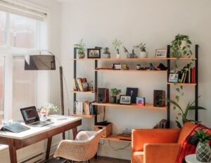
The Power of the Accent Wall
An accent wall is a single wall in a room that is painted a different color or has a different finish from the other walls. This technique can add visual interest and depth to a space without overwhelming it.
Strategic Placement
Choose an accent wall that naturally draws the eye, such as the wall behind a fireplace, a headboard, or a prominent piece of artwork. The accent can be a bold, contrasting color or a deeper, richer shade of the main wall color. This is like placing a spotlight on a particular feature, drawing attention and creating a focal point.
Textural Finishes
Consider using a textured paint or a faux finish on an accent wall for added dimension and sophistication. This can include techniques like Venetian plaster, limewash, or even a subtle metallic sheen. This is akin to adding an artisanal touch, elevating the ordinary to the extraordinary.
Two-Tone Walls for Visual Interest
Painting the lower portion of a wall one color and the upper portion another can create a visually dynamic effect. This can break up large wall spaces and add a sense of architectural interest.
Modern Combinations
Contemporary combinations often involve pairing a neutral color on the lower half with a lighter shade or a complementary color on the upper half. This can subtly enhance the architectural features of a room. This is like giving a room a stylish pair of trousers and a complementary shirt.
Classic Approaches
Some classic approaches involve wainscoting or a chair rail, with a different color or finish applied above and below. This can add a sense of tradition and elegance. This is the timeless elegance of a well-tailored suit.
Ceilings: The Fifth Wall
Don’t overlook the ceiling. Painting it a color other than white can dramatically alter the perception of a room.
Lighter Shades for Height
A lighter shade than the walls can make a ceiling appear higher, creating a sense of airiness and spaciousness. This is like lifting the roof, allowing more light and a feeling of openness to permeate the space.
Darker Shades for Intimacy
A darker color on the ceiling can lower the perceived height of a room, creating a more intimate and cozy atmosphere. This can be particularly effective in larger rooms or in spaces like studies or media rooms. This is like drawing a comfortable canopy overhead, fostering a sense of enclosure and focus.
Accent Colors
A bold accent color on the ceiling can create a surprising and dramatic statement, adding a unique personality to the room. This is the unexpected twinkle in the eye, adding personality and intrigue.
When selecting interior paint colors, it’s essential to consider how they will complement other elements in your home, such as countertops. For a deeper understanding of how to harmonize your interior design choices, you might find this article on choosing the perfect kitchen countertop material particularly helpful. The right combination of paint and countertop can create a cohesive and inviting atmosphere in your space.
Considerations for Longevity and Style
| Color Name | Hex Code | Finish Options | Best Room Use | Light Reflectance Value (LRV) | Popularity Rating (1-10) |
|---|---|---|---|---|---|
| Alabaster | #F2F0EB | Matte, Satin, Semi-Gloss | Living Room, Bedroom | 82 | 9 |
| Repose Gray | #CBC6C1 | Matte, Eggshell, Satin | Kitchen, Bathroom | 58 | 8 |
| Naval | #2C3E50 | Matte, Satin, Semi-Gloss | Accent Wall, Office | 8 | 7 |
| Soft Chamois | #E6D6B8 | Matte, Satin | Dining Room, Hallway | 70 | 6 |
| Sea Salt | #CED2CC | Matte, Eggshell | Bathroom, Bedroom | 63 | 8 |
When choosing paint colors, it is important to consider not only current trends but also the longevity of the choice and its compatibility with your existing décor.
Timeless vs. Trendy
While it is exciting to embrace current color trends, consider which colors will have enduring appeal. Neutral palettes and classic shades of blue, green, and
off-white tend to remain stylish for longer periods. Trendy colors may require more frequent repainting to maintain a fresh look. This is the difference between a fleeting fashion statement and a classic enduring style.
Coordinating with Existing Elements
The chosen paint colors should harmonize with your existing furniture, flooring, and architectural features. Consider the undertones of your existing materials. For example, a warm-toned wood floor will likely pair better with warmer wall colors, while a cool-toned gray floor might complement cooler wall colors. This is about ensuring all the players on the design team are working in concert, not in opposition.
Lighting’s Influence
The type and amount of light in a room will significantly affect how a paint color appears. Natural light can make colors appear brighter and truer, while artificial light, particularly incandescent bulbs, can cast a warmer, sometimes yellowish, tone. Always test paint samples in the actual room under different lighting conditions before making a final decision. This is like understanding how a stage light can alter the appearance of an actor’s costume; light is the director of color’s performance.
By carefully considering color psychology, current trends, application techniques, and practical considerations, you can select interior paint colors that will truly transform your home and provide a fresh new look for years to come.
FAQs
What are the most popular interior paint colors?
Popular interior paint colors often include neutral shades like whites, grays, and beiges, as well as soft blues and greens. These colors are favored for their versatility and ability to create a calming atmosphere.
How do I choose the right paint color for a room?
To choose the right paint color, consider the room’s lighting, size, and purpose. Test paint samples on the walls and observe them at different times of day. Also, think about the existing furniture and décor to ensure the color complements the space.
What is the difference between warm and cool paint colors?
Warm paint colors have undertones of red, orange, or yellow and tend to create a cozy, inviting atmosphere. Cool paint colors have undertones of blue, green, or purple and often make a room feel calm and spacious.
Can paint color affect the mood of a room?
Yes, paint color can significantly influence the mood of a room. For example, blues and greens are calming, yellows can be energizing, and reds may evoke warmth and excitement. Choosing the right color can enhance the desired ambiance.
How many coats of paint are typically needed for interior walls?
Most interior walls require two coats of paint for even coverage and a smooth finish. However, the number of coats can vary depending on the paint quality, color change, and wall condition. Primer may also be needed for better adhesion and color accuracy.