2026 Home Color Trends: In with the New, Out with the Old
The landscape of interior design is in constant flux, with color palettes serving as a primary indicator of evolving aesthetic sensibilities. As 2026 approaches, a discernible shift is underway, moving away from some of the saturated and intensely moody tones that have dominated recent years. Instead, a more considered and nuanced approach to color is emerging, prioritizing a sense of calm, connection to nature, and an understated sophistication. This transition signifies not a complete rejection of past trends, but rather a thoughtful evolution, integrating fresh perspectives while retaining elements that have proven enduringly popular. The coming year will see a reevaluation of what constitutes a harmonious and inviting living space, with color playing a pivotal role in achieving these objectives.
The persistent influence of biophilic design continues to shape color choices, with a strong emphasis on palettes that draw inspiration from the natural world. This trend is not merely about replicating the exact shades of a forest or a seascape, but rather about capturing the feeling of tranquility, rejuvenation, and groundedness that these environments evoke. Expect to see a significant increase in colors that reflect the organic, the earthy, and the subtly vibrant elements found in nature.
Earthy Neutrals Evolve
While neutrals have long been a staple of interior design, the offerings for 2026 are moving beyond the predictable grays and beiges. These new neutrals possess a deeper resonance, drawing from the rich tones of soil, stone, and unrefined natural materials.
Warm Terracottas and Russets
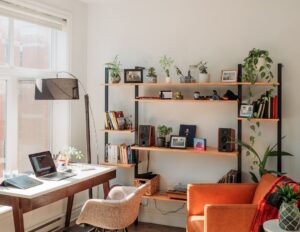
Terracotta, in its various manifestations from soft, dusty rose to more robust, brick-like hues, is poised for a significant resurgence. This warm, earthy shade offers a grounding presence without being overly dominant. It pairs exceptionally well with a range of other colors, from cool blues to verdant greens, creating a sophisticated and inviting atmosphere. Russet tones, reminiscent of autumn leaves and aged wood, also contribute to this earthy palette, adding depth and a touch of rustic charm. These colors work effectively in living areas, bedrooms, and even kitchens, providing a sense of warmth and stability.
Sand and Clay Tones
Beyond terracotta, a broader spectrum of sand and clay-inspired neutrals will take center stage. These colors are characterized by their subtle variations, offering a soft, organic foundation for any room. Think of the muted tones of sun-baked earth, the creamy undertones of weathered stone, or the delicate variations found in natural fibers. These muted shades are particularly effective in spaces where a sense of calm and serenity is paramount, such as bedrooms and bathrooms. They act as a serene backdrop, allowing other elements of the design to take prominence, while still offering an inherent warmth.
Soft, Buttery Off-Whites
Moving away from stark whites and cool ivories, 2026 sees a preference for off-whites with a subtle, creamy or buttery undertone. These shades retain the brightness and airiness of white but inject a welcome dose of warmth and softness. They are less clinical and more inviting, creating a gentle and welcoming ambiance. These variations work exceptionally well in creating a cohesive and airy feel throughout an entire home, acting as a neutral canvas for a variety of accent colors and furnishings.
Botanical Greens Gain Prominence
Greens, in their myriad forms, will continue to be a dominant force in color trends, reflecting a growing desire to bring the outdoors in. However, the greens of 2026 are likely to be more nuanced and sophisticated than the bolder, saturated greens of previous years.
Muted Sage and Olive Greens
Sage and olive greens, with their inherent earthiness and calming properties, are particularly strong contenders. These muted shades evoke the quietude of dappled sunlight filtering through leaves or the subtle hues of moss-covered stones. They provide a sense of natural tranquility and can be used in various applications, from accent walls to complete room schemes. These greens are versatile, able to complement both warm and cool color palettes, making them a flexible choice for designers and homeowners.
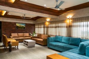
Deeper, Forest Greens
While muted tones will dominate, deeper, more saturated forest greens will also find their place, particularly in spaces where a sense of depth and drama is desired. Think of the rich, dark hues of an ancient woodland, offering a sophisticated and grounding presence. These darker greens can be used to create more intimate and enveloping spaces, such as studies or media rooms, and can also serve as a striking accent color against lighter neutrals.
Subtle Aqua and Teal Undertones
A subtle infusion of aqua and teal undertones within green palettes will also emerge. These shades hint at the presence of water, adding a refreshing and serene quality. They are not overtly blue-greens but rather greens that possess a cool, watery depth, offering a unique and contemporary twist on botanical palettes. These hues can introduce a touch of understated vibrancy without overwhelming the senses.
The Palette of Serenity: Calming Blues and Muted Lavenders
Beyond the earth-inspired palettes, a group of colors embracing serenity and calm will become increasingly popular. These shades are designed to promote relaxation, mindfulness, and a sense of peaceful refuge within the home.
Soft, Dusty Blues
The blues of 2026 will lean towards softer, more muted variations. Think of the gentle hues of a clear sky at dusk, or the subtle tones of well-worn denim. These shades are less dramatic than oceanic blues or intense navies, offering a sense of understated elegance and tranquility.
Sky Blues with Gray Undertones
Sky blues that possess a subtle gray undertone will be particularly prevalent. These colors are sophisticated and calming, evoking a sense of open space and quiet reflection. They are versatile and can be used in a variety of settings, from bedrooms to living areas, creating a sense of airy spaciousness.
Muted Denim and Slate Blues
Muted denim and slate blues will also feature prominently. These colors offer a grounded and stable feel, reminiscent of natural stone or well-loved textiles. They provide a sophisticated and contemporary feel without being overly trendy, making them a practical and stylish choice for long-term appeal.
Embracing Muted Lavenders and Lilacs
Emerging from the warmer end of the spectrum, muted lavenders and lilacs are set to make a significant impact. These colors offer a gentle and comforting embrace, moving away from overly vibrant purples towards more sophisticated and understated interpretations.
Dusty Rose-Lavender Hybrids
A particularly interesting development will be the rise of colors that bridge the gap between dusty rose and soft lavender. These hybrid shades offer a unique blend of warmth and coolness, creating a sophisticated and subtly romantic aesthetic. They are less overtly sweet than traditional pinks and more grounded than pure purples.
Muted Lilac with Gray Undertones
Muted lilacs that incorporate a hint of gray will also be popular. These shades possess a sophisticated and understated quality, evoking a sense of calm and introspection. They are a more mature and nuanced interpretation of purple, offering a gentle yet impactful presence. These colors can add a touch of personality without compromising the overall serenity of a space.
Nuanced Warmth: Beyond Beige and Cream
While neutrals will remain important, their character is evolving. The focus shifts towards colors that offer a gentle, nuanced warmth, moving beyond the sometimes sterile feel of pure beiges and creams. These warmer tones aim to create inviting and comfortable environments.
The Re-emergence of Soft Pinks and Peaches
Soft, muted pinks and peaches, often with a more desaturated and sophisticated feel than their intensely saturated counterparts, are making a comeback. These colors are no longer solely associated with children’s rooms but are being embraced for their ability to create warm, welcoming, and subtly elegant spaces.
Desert Rose and Terracotta Pinks
Pinks that lean towards warmer, earthier tones, such as desert rose or soft terracotta pinks, will be particularly popular. These shades offer a grown-up take on pink, grounding the color with an earthy resonance. They are warm and inviting without being overwhelming, creating a sense of gentle comfort.
Muted Peach and Apricot Tones
Similarly, muted peach and apricot tones will be favored over brighter, more saccharine versions. These colors evoke the subtle warmth of dawn or the soft glow of ambient light, adding a delicate and sophisticated layer of warmth to interiors. These warmer hues are excellent for creating intimate and cozy spaces.
The Subtle Allure of Dusty Golds and Bronzes
Metallic finishes are also seeing a shift, with a move away from high-shine chromes and silvers towards richer, more subdued metallic tones. Dusty golds and bronzes offer a sophisticated glow that adds depth and warmth without being ostentatious.
Antiqued Gold Finishes
Antiqued gold finishes, with their muted sheen and understated elegance, will be favored over bright, polished golds. These finishes evoke a sense of history and craftsmanship, adding a touch of timeless sophistication to furniture, lighting, and decorative accents.
Warm, Burnished Bronzes
Warm, burnished bronzes will also see a rise in popularity. These colors offer a rich and inviting metallic tone, adding depth and character to various design elements. They work particularly well in spaces that embrace natural materials and textures, enhancing the overall sense of warmth and authenticity.
A Nod to Nostalgia with a Modern Twist
While innovation is key, there’s also a growing appreciation for colors that evoke a sense of nostalgia, but presented with a contemporary sensibility. This isn’t about replicating past decades verbatim, but rather about drawing inspiration from their palettes and reinterpreting them for modern living.
Mid-Century Inspired Blues and Greens
The enduring appeal of mid-century modern design continues to influence color choices. Expect to see a resurgence of the iconic blues and greens of that era, but with a softened and more muted presentation.
Teal and Aqua Undertones Reimagined
Teal and aqua shades that characterized mid-century interiors are still relevant, but in 2026, they will likely appear in more desaturated, perhaps slightly grayed-down versions. This offers a sophisticated and less overtly retro feel, making them more adaptable to contemporary spaces.
Muted Emerald and Jade Greens
Muted emerald and jade greens, reminiscent of iconic mid-century furniture and ceramics, will also gain traction. These rich, yet not overly saturated, greens offer a sense of depth and sophistication, adding a touch of vintage charm with a modern sensibility.
The Return of Moody, Yet Refined, Bourban Browns
While bright, saturated colors might be stepping back, there’s still a place for depth and richness. Moody, yet refined, bourbon browns are emerging as a sophisticated alternative to stark blacks or grays.
Coffee and Caramel Browns
Rich coffee and caramel browns offer a warm, inviting, and grounding presence. These colors are less intense than true blacks but provide a similar sense of depth and sophistication. They are excellent for creating cozy and enveloping spaces.
Deep Chestnut and Mahogany Tones
Deep chestnut and mahogany tones will also feature, adding a touch of classic elegance and understated luxury. These hues evoke the warmth of natural wood and polished leather, contributing to a refined and timeless aesthetic. These deeper browns offer a sense of gravitas and can be used to create impactful accent walls or statement furniture pieces.
The “Quiet Luxury” Aesthetic and its Color Manifestations
“`html
| Color Trend | What’s In | What’s Out |
|---|---|---|
| Earthy Tones | Warm, natural hues like terracotta and olive | Cool, icy tones |
| Moody Blues | Deep, rich blues like navy and indigo | Pastel blues |
| Warm Neutrals | Beige, taupe, and warm gray | Cool grays |
| Spicy Reds | Rich, bold reds like burgundy and terracotta | Bright, primary reds |
“`
The overarching theme driving many of these color trends is the rise of the “Quiet Luxury” aesthetic. This approach to interior design prioritizes quality, craftsmanship, and understated elegance over ostentatious displays of wealth. Color plays a crucial role in achieving this sophisticated and serene ambiance.
Harmonious Palette Integration
“Quiet Luxury” thrives on the harmonious integration of color. Instead of jarring contrasts, the focus is on creating cohesive palettes where colors flow seamlessly from one space to another. This is achieved through the judicious use of color families and subtle tonal variations.
Monochromatic and Analogous Schemes
Monochromatic and analogous color schemes will be favored for their ability to create a sense of calm and unity. A monochromatic scheme utilizes different shades, tints, and tones of a single color, while an analogous scheme uses colors that are adjacent to each other on the color wheel. Both approaches promote a feeling of visual continuity and serenity.
Subtle Gradations and Tonal Shifts
The emphasis will be on subtle gradations and tonal shifts within a chosen palette. This means moving through a color family with nuanced differences rather than abrupt changes. This creates a sophisticated and layered look that feels both intentional and understated.
Color as an Investment in Well-being
The colors selected for homes in 2026 are not merely decorative; they are increasingly viewed as an investment in the occupants’ well-being. The trend moves away from colors that can be visually fatiguing or anxiety-inducing and towards those that promote relaxation, focus, and a sense of contentment.
Creating Zones of Calm
Color will be strategically used to create distinct zones of calm within the home. This might involve using cooler, more muted tones in bedrooms and studies, and slightly warmer, more welcoming tones in living areas. The goal is to enhance the functionality and emotional resonance of each space.
The Psychology of Color in Practice
Designers and homeowners are becoming more attuned to the psychological effects of color. The subtle greens and blues are chosen for their calming properties, while the earthy neutrals provide a sense of grounding and stability. This conscious application of color psychology contributes to creating homes that are not only aesthetically pleasing but also supportive of mental and emotional health. The choices reflect a desire for sanctuaries, places that offer respite from the external world and promote inner peace.
FAQs
What are the popular color trends for homes in 2026?
In 2026, popular color trends for homes include earthy tones such as terracotta, olive green, and warm neutrals. Additionally, bold and vibrant colors like deep blues and rich yellows are also gaining popularity.
What colors are considered outdated for homes in 2026?
Outdated colors for homes in 2026 include cool grays and stark whites, as well as overly bright or neon colors. These colors are being replaced by warmer, more inviting tones.
Are there any specific color combinations that are trending for home interiors in 2026?
Yes, popular color combinations for home interiors in 2026 include pairing warm neutrals with pops of bold color, as well as creating contrast with dark and light shades. Mixing and matching earthy tones with vibrant hues is also a popular trend.
How can homeowners incorporate the latest color trends into their homes?
Homeowners can incorporate the latest color trends into their homes by painting accent walls, adding colorful furniture and decor, and using textiles such as rugs and curtains in trending colors. Additionally, updating kitchen and bathroom cabinets with on-trend colors can make a big impact.
Are there any timeless color choices that will never go out of style?
While color trends come and go, timeless choices such as soft blues, warm grays, and classic whites are unlikely to ever go out of style. These colors can serve as a versatile base for any home decor and can be easily updated with accent pieces to stay current with trends.