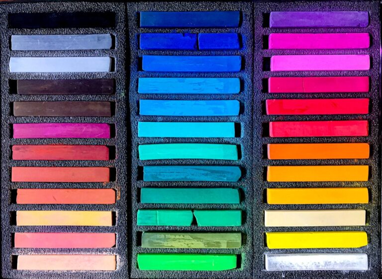
Color plays a pivotal role in design, influencing emotions, perceptions, and even behaviors. It serves as a powerful tool that can evoke feelings of warmth, excitement, calmness, or even sadness. Designers understand that the right color palette can transform a mundane space into an inviting environment or a simple product into a coveted item.
The psychology of color is deeply embedded in the fabric of design, guiding choices that resonate with audiences on both conscious and subconscious levels. As trends evolve, so too does the significance of color, making it essential for designers to stay attuned to the shifting landscape of color preferences. In recent years, the design world has witnessed a plethora of color trends that have come and gone, each leaving its mark on various industries.
From the vibrant hues of the 1980s to the minimalist palettes of the 2000s, color trends reflect broader cultural movements and societal shifts. As designers navigate this ever-changing terrain, they must not only consider current trends but also anticipate future directions. This article explores some of the fading color trends that have dominated the design landscape, examining their impact and the potential for new and unexpected color choices to emerge.
Key Takeaways
- Color plays a significant role in design, impacting emotions and perceptions.
- Neon colors are losing popularity as a design trend.
- Muddy browns and beiges are considered dull and uninspiring choices in design.
- Overused grays are declining as a go-to neutral color in design.
- Faded pastels are seen as a lackluster palette choice in design.
Neon Colors: A Fading Trend
The Decline of Neon
However, as time has progressed, neon colors have begun to lose their luster. The initial shock value that made them so appealing has diminished, leading many designers to seek more sophisticated alternatives. The overuse of neon shades has contributed to their decline, as they can often overwhelm rather than enhance a design.
A Shift Toward Balance and Harmony
The shift away from neon colors reflects a broader desire for balance and harmony in design. As consumers increasingly gravitate toward more muted and natural palettes, the once-dominant neon shades are being relegated to niche applications or retro-inspired projects.
A New Era of Design Sensibilities
Designers are now exploring ways to incorporate brightness without resorting to the harshness of neon. This evolution signifies a maturation in design sensibilities, where subtlety and nuance are valued over sheer vibrancy.
Muddy Browns and Beiges: A Dull Choice
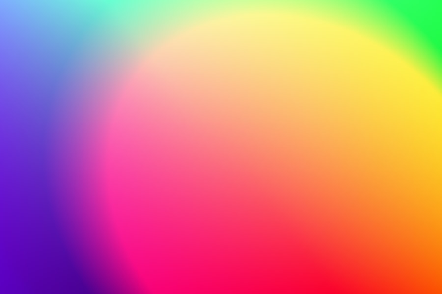
Muddy browns and beiges have emerged as colors that many designers are beginning to shy away from. While these earthy tones can evoke a sense of warmth and comfort, their overuse has rendered them somewhat uninspired. In a world where consumers are seeking fresh and invigorating experiences, muddy browns and beiges often feel stagnant and lackluster.
They can create an atmosphere that is more reminiscent of outdated design trends than contemporary aesthetics. Moreover, the prevalence of these colors can lead to a sense of monotony in design. When used excessively, muddy browns and beiges can dull the vibrancy of a space or product, making it blend into the background rather than stand out.
Designers are increasingly recognizing the need for more dynamic color choices that can breathe life into their work. As they move away from these subdued tones, they are exploring bolder options that reflect individuality and creativity.
Overused Grays: The Decline of a Neutral
Grays have long been hailed as a versatile neutral in design, offering a sophisticated backdrop for various styles and aesthetics. However, the overuse of gray has led to its decline as a favored choice among designers. Once celebrated for its ability to complement other colors seamlessly, gray has become synonymous with blandness and uniformity.
In an era where uniqueness is prized, designers are beginning to question whether gray still holds its place as a go-to neutral. The saturation of gray in design has resulted in a longing for more vibrant alternatives. Designers are now turning to warmer neutrals or even bold colors that can provide depth and character without sacrificing versatility.
This shift reflects a desire for spaces that feel alive and engaging rather than sterile and impersonal. As designers seek to break free from the constraints of overused grays, they are embracing a wider spectrum of colors that can elevate their work and resonate with audiences on a deeper level.
Faded Pastels: A Lackluster Palette
Faded pastels have enjoyed their moment in the spotlight, often associated with softness and tranquility. However, as trends evolve, these muted shades are beginning to lose their appeal. While they can create a serene atmosphere, faded pastels often lack the vibrancy needed to make a lasting impact in design.
Their subdued nature can render them forgettable, leading designers to seek out more striking alternatives that capture attention and inspire emotion. The decline of faded pastels signals a shift toward bolder color choices that convey confidence and energy. Designers are increasingly drawn to rich jewel tones or vibrant primary colors that can infuse life into their work.
This transition reflects a broader cultural movement toward authenticity and self-expression, where individuals are encouraged to embrace boldness rather than shy away from it. As faded pastels fade into the background, new palettes are emerging that celebrate individuality and creativity.
Artificial Blues and Greens: Uninspired Choices
The Limitations of Artificial Colors
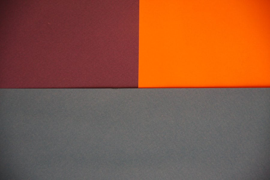
Artificial blues and greens often lack the depth and richness found in natural hues, leading designers to rethink their use in contemporary projects. This limitation has sparked a growing interest in organic color palettes that reflect a shift towards sustainability and environmental consciousness in design.
These nature-inspired colors not only enhance the aesthetic appeal of designs but also align with broader values surrounding sustainability and connection to the natural world.
A More Authentic Approach to Design
This movement towards authenticity in color palettes reflects a growing desire for genuine and meaningful design. By embracing natural hues, designers can create a deeper connection with their audience and contribute to a more sustainable and environmentally conscious design industry.
Loud and Clashing Color Combinations: A Design Faux Pas
In an era where maximalism has gained traction, loud and clashing color combinations have become more common in design. While bold choices can create visual interest, excessive clashing can lead to chaos rather than harmony. Designers must strike a delicate balance between experimentation and coherence; otherwise, they risk alienating their audience with overwhelming visuals that lack clarity.
The trend toward clashing colors often stems from a desire to stand out in a saturated market. However, this approach can backfire if not executed thoughtfully. Successful designs often rely on strategic color pairings that enhance rather than detract from one another.
Embracing New and Unexpected Color Trends
As the design landscape continues to evolve, it becomes clear that embracing new and unexpected color trends is essential for staying relevant in an ever-changing market. The fading popularity of neon colors, muddy browns, overused grays, faded pastels, artificial blues and greens, and loud clashing combinations highlights the need for innovation in color choices. Designers who dare to explore uncharted territories will find themselves at the forefront of emerging trends that resonate with contemporary audiences.
The future of design lies in the ability to adapt and experiment with color palettes that reflect individuality and authenticity. By moving away from tired trends and embracing fresh perspectives on color, designers can create work that not only captivates but also inspires meaningful connections with viewers. As they venture into this new realm of color possibilities, they will undoubtedly discover exciting opportunities for creativity and expression that redefine the boundaries of design itself.
FAQs
What are some colors to avoid in 2025 according to designers?
According to designers, some colors to avoid in 2025 include muddy brown, neon yellow, and dull gray.
Why should these colors be avoided in 2025?
Designers suggest avoiding these colors in 2025 because they may be considered outdated or unappealing to the current aesthetic trends.
Are there any alternative colors recommended by designers for 2025?
Yes, designers recommend embracing vibrant and bold colors such as electric blue, emerald green, and coral to stay on-trend in 2025.
How can the choice of colors impact design trends?
The choice of colors can significantly impact design trends as they can evoke certain emotions, set the tone for a space, and reflect the current cultural and societal influences.
Where can I find more information about color trends for 2025?
You can find more information about color trends for 2025 by following design publications, attending industry events, and consulting with professional designers and trend forecasters.

